International correspondent, Joe Simpson reports from the show and provides an overview of this major, global industry event.
Cersaie 2018 delivered once again, with an impressive 900 exhibitors and some stunning new collections. But this year’s show was more about evolution than revolution, with the reinvention of existing surface effects and added spice in terms of colour injections and decorative patterns.
Luxury looks
If one word summed up the over-riding feel of Cersaie 2018, it would be luxury. XXL slabs aimed at the worktop market, 20mm and 30mm exterior tiles cashing in on the inside-out lifestyle trend, and ventilated ceramic façades – as well as majestic marbles, cementine decors, and grungy concrete-effects – the overall trend was towards rich, embellished and confident designs. This is a significant contrast to the conservative feel of the event in 2016 and 2017.
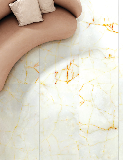
Marble-effects in 2018 trended towards more strongly veined forms, although white Carrara-style and near black riffs on nero marquinia, still led the way. This year the veining was often picked out in golden hues, or else the tiles were embellished by thin metallic listelli.
Quartzite and highly polished onyx both featured prominently, while impressive book-matched (two tiles with mirror images) and end-matched (a four-tile symmetrical pattern) XXL slabs, were displayed by several manufacturers to illustrate the sheer power and realism of the latest marble-effect porcelain tiles.
There appeared to be fewer chevrons, and other unusual geometric tile formats. However, hexagons are still very popular, as are triangles. One outcome of this was that there were fewer parquet-style wood ranges, and multi-format floor and wall tile displays.
Apart from marble- and cement-effects, the dominant floor tile trend was quite plain and conservative. There were grey and beige designs that fall somewhere in the stone to cement spectrum but appear to have no specific material inspiration. The trick seems to be to offer surfaces with just enough variety – be that speckles, lustre highlights, mottled colours or simulated ageing – to make the finished floor both visually interesting and practical in terms of maintenance. These “composite” looks seem set to grow as a category, both in floor and, increasingly, wall tiles.
One consequence of this composite trend was that simulated terracottas, lighter cottos, sandstone, and limestone looks were harder to find. They were squeezed out of this neutral space by light grey tile styles.
When it came to wall tiles, structured white tiles remain highly popular, with manufacturers reporting significant interest in matte and satin ranges in the medium and larger formats that have heavily structured relief decoration. Basically, these are tone-on-tone mosaic surfaces. Striped surface effects, where texture again provided the visual interest, were also major trend.
Blue and metallics
Blue was the stand-out accent colour at Cersaie 2018. It came in many different hues, from powder blue right through to intense cobalt, and classic Oxford blue. It was prominent in everything from XXL porcelain slabs right through to the displays created by mosaic specialists.
Rich blues were used to pick out the detail on white and neutral tiles, and it was also the go-to colour for the brush-effect decors seen throughout the show, adding an artisanal touch to many commercial ranges. Curved edge framing in tone-on-tone blue was one favoured way to bring this accent hue to the wall.
This year, Cersaie also had some surprising pops of bold colour and design. Multi-pattern melanges and vibrant mixes of primary colours were evident in some of the bolder displays, most notably by Codicer, Ornamenta, and Keros. While these eye-catching wall tile ranges may never be volume sellers, they can certainly provide an attention-grabbing display in any showroom.
The other main wall tile trend was a renewed focus on metallics. The widespread adoption of digital inkjet technology has broadened the range of potential applications for metallic effects.
With many inkjet stations that have dedicated metallic printheads, often bringing low temperature inks that vitrify at around 700oC, it is now possible to use metallic lustres as a decorative enhancement on many more ranges. This has resulted in gold veining on marble-effects, mica highlights on quartzite-inspired ranges, and a raft of pure metal designs including corten steel wall tiles, metallic glazed reproductions of embossed pressed tin tiles from the early 1900s, and satin steel forms that work with industrial chic styles.
These affordable metallic looks seem set for star billing at the cutting edge of wall tile design for years to come. Right now, gilded highlights seem the most likely of the current wave of metallic possibilities to make it to the mainstream. This is another clear sign of Cersaie 2018’s nod towards glamour and decadence.
Extra large tiles
XXL tiles and porcelain slabs were, as expected, at the fore. Marazzi unveiled its Grande range, including 1,600 by 3,200mm slabs in 6mm thickness and 1,620 by 3,240mm slabs in 12mm thickness. The emergence of thicker products demonstrates that manufacturers have realised that the perfectly flat subfloors required for laying thinner slabs are somewhat elusive. This makes the products harder to install and, therefore, less commercially attractive.
Marble effects in slab format were almost omnipresent and with more colours than ever. Casalgrande Padana, alone, had 34 different colours on display. The real wow factor came from book-matched and end-matched installations.
While XXL formats were a defining trend in 2017, other hot tickets from last year were less in evidence. Terrazzo, which featured so heavily in 2017, seems to have dropped off the radar although it will still be pushed for commercial projects.
At Cersaie 2018, terrazzo and stracciatella options really only had star billing on some of the non-European manufacturers’ stands. This is an indication that while many countries have invested in the advanced production technology to produce such ranges – continuous pressing, double charging, powder depositors, and digital inkjet decoration – Spain and Italy still have the edge when it comes to recognising and exploiting cutting-edge design trends.
Wood-effects
There are more European interpretations of wood-effects in evidence at Cersaie, although they were not as prominent as they have been over the past decade. Still, just when you thought every wood type had already been digitally printed onto tiles, this year saw bamboo (yes, I know, it’s a grass not a wood) and the Japanese charred wood-effect Shou Sugi Ban, among other off-beat takes on timber.
Marazzi offered an interesting timber twist with ranges that are 100mm and 150mm wide but come in differing lengths. These are sold in pre-packed boxes to allow easy creation of a random planked floor.
Another development in wood-effects was longer planks that utilise Continua+ cut slab production. This offers competition for the now dominant 200 by 1,200mm plank format.
These larger plank formats, notably 300 by 1,800mm, re-emphasise the super realistic graining, knots, and natural colouration of the best porcelain imitations. Highly polished wood-effects also convey a “just oiled” look and recall experiments carried out some 10 or so years ago with extra thick, high gloss, flowing glazes.
New surfaces
Contemporary surfaces such as cement, plaster, concrete, and resin have been selling well, and there were many fresh takes on them at the show. However, unless viewed as large tiled areas, these designs can be difficult to visually understand, as one tile on its own looks much like another. It was also interesting to note that, alongside the ubiquitous greys, some manufacturers are starting to experiment with concrete-effects in other hues including blue, green, brown and even pink.
Overall, concrete-effect designs have become even more sophisticated. Some of the brush-effect horizontal stripe decors – a development from the more vertically-oriented shuttered concrete look – were particularly effective. They added a subtle, visual punctuation without weakening the sought-after industrial aesthetic.
Other trends include alternating plain strips with raised strips in a heavy texture, and décor inserts with plain glazed ceramic tiles or wood-effect pieces.
On a similar theme, Verde 1999 have combined three material effects – stone, metal and concrete – into one tile for its Matrix series, which has a large pentagon shape. These material mixes were one of the main design directions at Cersaie 2018, and looks likely to be a continuing area of experimentation in the years ahead.
There were many examples of coloured decorative patterns for flooring, such as Marazzi’s D-Segni range that introduced hues such as dusty indigo, tangerine, and mustard.
Spanish manufacturer Equipe’s Art Nouveau collection demonstrated the trend for the softening of monochromatic patterns, with subtle use of colour, all suited to creating repeating patterns from groups of smaller tiles. An increasing number of factories offered collections of encaustic style multi-pattern floor tiles. So it is safe to say that this look is not going away any time soon.
Concrete-effects
The pairing of concrete-effect tiles with contrasting material influences was a notable trend. They were paired with wood-effect tiles, as well as marble-effects, stone-effects, and metallic-effects.
There were a lot of material fusions with tiles that fuse parts of natural stone with elements of concrete. The result are neutral colourways, unexpected subtle surface patterns, and engaging textures.
These materials point one way forward for tile design. Digital scanning, image manipulation software, and digital inkjet technology are combined to offer tile designers another set of aesthetic options.
Ariana proved a case in point as it showcased a number of novel ceramic surfaces at Cersaie including Worn, inspired by leather. When realised in cement tones, notably in the Shadow design, this range enhanced the neutral industrial palette by adding this unexpected surface texture. This stylistically eclectic combination would look equally at home in residential, commercial, or public spaces.
The larger Worn tiles have 30 “leather” patches in four colours, the rectangular tiles 11 patches. It comes in four rich earth tones: Stone, Mud, Copper, and Shadow.
Ariostea displayed Ultra Con.Crea Maxi Slabs alongside 1,200 by 600mm, 600 by 600mm, and 600 by 300mm formats for more compact architectural spaces. It has four colours – Cloud, Earth, Ink and Talc – in traditional sizes. In addition, Dove Grey, a soft, neutral shade, comes in all sizes.
Concrete-effect does not have to be sterile, minimalist, and surfaces without personalities. One of the most imaginative ranges comes from Hyper by Flaviker. This is provided in “Wide”, the term used by the company to refer to the large, lightweight porcelain slabs produced in a 7mm thickness using Continua+ production technology. The same pressing system, based on dry compaction of raw materials, is also used to produce the 9mm thick sizes.
Hyper displays all the signs of the natural ageing process in concrete blocks used in industrial building. Cracks, holes, and stains are accurately reproduced using latest-generation digital technology.
The three main colour options – taupe, grey, and silver – are complemented by some very powerful decors – Street Lover, Tiger, and Rose – that bring an urban, street art, graffiti vibe. There is even a cut piece option – Hyper Slim Pack – that set these neutral tones against contrasting or statement grout colours.
A variation on the concrete-effect theme is provided by Artifact of Cerim, a glazed porcelain range that offers a different take on spatulated cement. Its aesthetic impact, antiqued and imperfect, is enhanced by shade variations spanning cool and warm tones. The names – Worked Charcoal, Vintage Taupe, Crafted Graphite, Used Grey, Worn Sand, and Aged White – refer to the manual plastering technique that influenced them.
Iris’ Downtown transfers concrete to porcelain surfaces for projects with a minimalist, contemporary character. It comes in four contrasting shades, ranging from grey to brown, and three sizes, 1,200 by 600mm, 600 by 600mm, and 300 by 600mm. The retro effect, obtained through scratches and colour contrasts, gives the collection a naturally worn look.
The Ikon collection, new to Ceramiche Keope’s portfolio, has the soul of concrete. Drawing inspiration from urban style, this range reinterprets the raw reference material as porcelain stoneware. With its new 1,200 by 2,780mm maxi size, Ikon is ideal for creating continuous walls and floors.
Keope has a selection of neutral tones: Sky, Grey, Beige, Silver, and White. These are available with a matte finish, and to complete the line, it offers trim pieces and decors.
Resin-effects form a selective, yet important, sub-class of the concrete-effect trend. A good example is Paris by NovaBell, a modern design that evokes the paired-back beauty of resin surfaces to bring about spaces with an urban-chic allure. The Paris colour range has five natural, dusty shades – Plume, Amande, Ash, Ciment, and Noir – conceived for use in combination, or for monochrome spaces.
The full appeal of the Paris tile is best seen in the 1,200 by 1,200mm size, that constructs a visual continuity to the vibrant patterns and tactile variations.
Panaria’s Context is based on cement mortar, a traditional building material based on pure cement and fine inert minerals. Panaria has enhanced this material’s qualities to create a surface with a different aesthetic and texture. It is available in five shades of grey – Square, Loft, Store, Hangar, and Mansion – with mosaics and decors adding extra design scopes.
Context introduces the 6mm thickness in 1,200 by 1,200mm, and 1,200 by 2,600mm laminated porcelain panels. In addition to thin slabs, the range is also available in the more typical porcelain stoneware thickness of 10mm, plus 20mm for outdoor use.
All the products in Panaria’s latest collections feature Protect antibacterial shield, and are part of the selection of products with Microban anti-bacterial surfaces.
The cement-effects in Porcelanosa’s HighKer series of XXL format ceramic tiles blur the lines between stone and cement. With four finishes and several different formats, its surfaces generate an optical continuity that maximises the feeling of spaciousness.
TexCem, a Ragno tile collection, reflects the retro look of dilapidated concrete with a fine fabric weave. A single, rectified 325 by 977mm size is used across the five colours: Avorio, Cotto, Ottanio, Grigio, and Bianco. Available in a thickness of just 6mm (8mm for structures), it is intended for residential and light commercial use.
This range has two 3D structures, three decors, and one mosaic option. The Groove 3D structure emphasises the flaws of concrete. The Tria 3D structure consists of triangular and square shapes that emerge on the surface of the material and underline its form.
TexCem is completed by various decors. Patch consists of a mix of ornamental geometrical patterns simulated by the world of fabrics. Esagone alternates decorated and solid colour modules with a vintage flavour while Magnolia, a decor in the large 1,300 by 977mm size, comprises four elements and reinterprets the floral motifs of wallpaper.
RAK’s M-Project is an exclusive concept that integrates materials such as stucco, spatulated resins and woods, co-ordinated in a single colour palette. Floors and walls gradually combine into a single stylistic solution, something really evident in the M-Project Stucco variant. The theme continues with M-Project Spatolato where the look and surface effects of spatulated resins and woods show the passage of a craftsman’s hand.
The future shape of tiles
One of the features at this year’s Cersaie exhibition was floor and wall tiles that featured multi-shape plain colour decoration. Here triangles, parallelograms, trapezoids, rectangles or simple strips – among other shapes – are used in contrasting or complementary colours to provoke interest on the face of individual tiles. There are virtually limitless pattern possibilities when creating multi-tile wall or panels.
They usually have two or three colours per tile, and the same geometric design often has different colour choices. This allows home owners or designers to select neutral decors to sit against plain neural field tiles, or more vibrant options to provide a pop of colour on a splashback or border.
A good example is Play by ABK. This 200 by 200mm range upholds the playful and decorative spirit of ceramics. It portrays patterns, graphic effects, and colours of majolica and cement tiles, as well as more modern elements.
With its distinctive shabby chic aesthetic, Alba Naya Sand by Bestile builds on the recent fashion for hydraulic tiles. Alba Naya Sand is 15mm thick and has a chameleon surface. It is billed as “a tile with a shabby-hydraulic soul”. The format is 200 by 200mm, with a variety of geometric shapes that can be used to achieve complex floor patterns.
Curves rather than straight-edged geometrics, are the key element of Paris by CIR. This range offers a highly-refined interpretation of living spaces through a selection of soft, welcoming colour shades, and exclusive texture. Paris’ metropolitan colours, ranging from classic black and dark grey, through to midnight blue, light blue, green, white and old rose, are a real eye-catcher. The range is completed by artistic elements in geometric and floral forms, ideal for creating bold inserts and stylish details.
Oslo by Codicer 95 is a 250 by 250mm range of decorated tiles, that riffs the geometric forms in an on-trend blue palette. With a matte finish, this tile can be used on both floors and walls. What really makes this range stand out, however, is the Cage décor that features a series of vertical, horizontal, and diagonal lines cut into its surface. The resulting surface has great tactile appeal.
A similar decorative device is used to very different effect in Iris Ceramica’s Arqui range; a new collection of 200 by 200mm tiles with surfaces full of detail and eclectic elegance. Arqui reinterprets the ornamental richness of Venetian terraces in a contemporary key, combining the crushed porcelain of Italian tradition with colourful, superimposed geometric figures. It can transform surfaces into precious tapestries.
Panaria’s Even range is another to play with multiple geometries as a decorative device. Working alongside designs such as Cherry and Shapes Snow in 350 by 1,000mm, the 350 by 350mm Geometric décor, which comes in Warm (red and beige) and Cold (green and blue grey with beige). This range also offers a striking colour palette in both 350 by 1,000mm plain and 3D relief tiles – Snow cream, Ivory beige, Cherry red, Dove taupe, Leaf green, and Ocean grey/blue – alongside three medley decors that nod towards the hydraulic trend.
Falling somewhere between this geometric vibe and the on-going encaustic/hydraulic trend, Rondine’s Swing collection has evolved from the Portland cement looks of the 1930s into a retro modern range in a classic 203 by 203mm moulded format that recalls Op-Art and Art Deco. The single decors and 19-piece mixes, in the three beige, blue and black and white ranges, are accompanied by five matching plain-coloured tiles.
At the high end, this décor direction is being followed by aspirational brands such as Ceramiche Piemme’s Valentino. It was back in 1977 when Ceramiche Piemme obtained the licence to use the label of one of Italy’s great fashion designers, Valentino. For over 40 years, Piemme has presented high-end tile designs using this brand.
One of the latest examples is Incipit. Here restrained floor tiles, such as Incipit bone in 600 by 1,200mm, provide the ideal backdrop for the cool elegant patchwork 400 by 1,200mm wall tiles of Incipit brancato. Using special glazes and the precision of the latest-generation digital decoration, the ceramic surfaces re-create the delicate effect of linen, arabesque silks, and even the metal meshes of contemporary fabrics.
Now firmly established at the cutting-edge of tile design, Spain’s Vives is one of the pioneers of this geometric fusion trend. It is best seen in the Resort range in which Vives further experiments with sizes, finishes, and aesthetics. Delivering avant-garde and timeless settings with a discreet elegance, the Resort designs include Nassau, a porcelain range that draws on the character of cement with graphics full of rich nuances and details. The matte finish and a subtle neutral colour range, is put together with white, cream, grey and graphite shades.
One of the tile ranges that really captured the prevailing mood at Cersaie 2018 was Dekorami, a collection of glazed stoneware tiles designed by Marcante-Testa for Ceramica Vogue. The collection is made up of three designs – Kolonne, Koriandoli, and Kodici – in a 250 by 250mm format. They are available in five colours with a gloss surface including blue and three lighter hues with a satin surface.