Tool purchases broadly fall into three categories: tools that have worn out that need to be replaced; tools that need to be upgraded; and tools that represent a new expansion to a business.
The first category is pretty much a “no brainer” for trade businesses. A worn or inadequate tool can cost a tile installer money — though there are times when it’s difficult to set aside a tool you have grown used to and come to rely on.
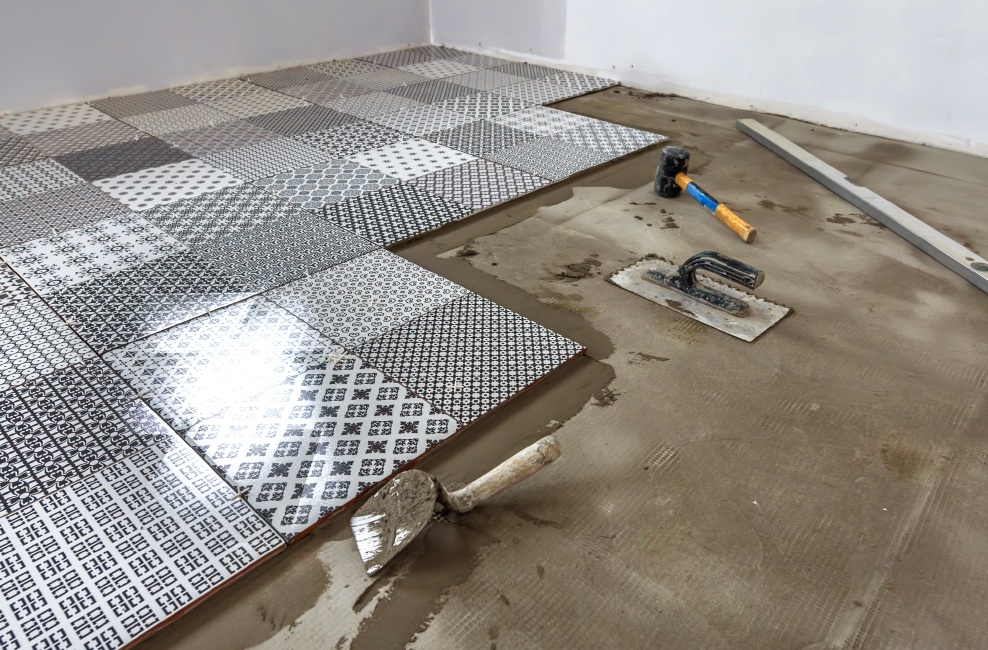
Upgrading tools is a more difficult decision. The most rapid innovation has been happening with cordless power tools, but that innovation has been somewhat uneven. It’s true that you can now buy more powerful, longer-lasting, lighter power tools than ever before, but how much of an advantage do they really deliver?
The one type of upgrade that is almost certainly worth it is one that delivers either more safety or better accuracy. Safety these days especially includes any exposure to dust or airborne particles, as these have become an increasing health concern. In terms of accuracy, laser levels in particular have continued to evolve.
Buying tools so as to either increase the amount of work that can be performed, or to add a new line of business often comes down to a risk assessment. Typically the cost of the tool may only “work” if it can be amortised over more work in a new area than a business currently performs. That means the business owner needs to work up a reasonable projection of how much revenue would increase after the purchase of the tool, as well as a measure of the profitability of that work.
Tool purchase alternatives
In terms of managing finances for purchases such as tools, there are two varying tracks regarding how to go about this during a time (like the present) when the future is not so much bleak as uncertain.
It’s quite a normal reaction to respond to this uncertainty by limiting borrowing commitments. That can mean paying down any form of debt, including credit cards, as much as possible. This is a sound, conservative practice for many businesses.
The second track is to go in almost the opposite direction. Many businesses see a period of uncertainty as a bad time to take out a business loan. But does that really make sense? If we know that there is going to be a rough patch of six to 12 months sometime in the next 30 to 36 months, but are confident that the market will return to something like 2019 levels afterwards, what is the best way to plan to get through that rough patch?
One way is for a business to maximise the total net amount of capital it has at its disposal. That could include, for example, taking out a loan, even though you do have enough current income to keep up with expenditures.
Your business would then have to cope with the extra costs of that capital — and you might never need to really use it. At the moment, though, interest rates on business loans (excluding application and upfront fees) are down to below 4.0% in many cases. That’s only a couple of percentage points above inflation.
Taking a loan before you absolutely need it does help a business get around one of the vagaries of how financing works. A business can choose to apply for a loan when they are going well, then utilise those funds when things get a bit tougher. But if that same business waits until things are getting tougher, and then applies for a loan, they are quite likely either not to get it, or to find that it is much more expensive.
The Swiss (who know a thing or two about banking) have a saying that covers this type of situation: “When it rains, the banks take away your umbrellas”.
To determine whether taking out a loan makes real sense, a business really needs to do some “contingency analysis” — which is a fancy way of saying you need to sit down with a spreadsheet, and work out what happens if cashflow dries up over a period of months.
That spreadsheet needs to cover all the fixed costs of the business and calculate variable costs as a percentage of revenue earned. You can project what revenue will be if we hit “COVID normal” by averaging revenue for FY2018 and FY2019, then reducing that (to be safe) by between 5% and 10%.
The big questions that comes out of this type of planning, of course, are how much of a downturn will the construction industry face, and just about when can we expect it to happen? Before you set out to invest some considerable sum in tools — whether it is great new tile saw, a set of cordless power tools, or even a vehicle — you really need to have some kind of answer to those questions.
Government support
One reason why the construction industry in general, and tile installers in particular, tends to be a little over-optimistic about the near future is that the industry believes the federal government will continue to subsidise construction. While that is not exactly wrong, it is also likely not exactly right, either.
Certainly, to this point in the recovery from the COVID-19 recession, construction has received a considerable boost. Interest rates have gone down to just 0.1%, and the HomeBuilder incentive package has added a nearly $700 million stimulus. The market appears to have responded by stabilising, at the very least.
However, these were largely emergency measures. The next stage of the recovery needs not to subsidise industries, but to stimulate industries that can contribute real growth to the economy.
The construction industry is not capable of delivering those growth opportunities. Real growth is, in large part, linked to growth in productivity. Being able to do more with less is what economies have been about since the first industrial revolution in the 18th Century. Yet over the past 12 years and more, the construction industry has not only grown productivity at a slow rate, it has at times actually lost productivity. While tools such as building information modelling (BIM) offer a possibility for better productivity, there are few prospects for growth in this area over the next four or five years.
Secondly, construction has few — if any — of what economists call “spillover effects”. A building consumes a number of resources in terms of materials, person-hours of labour, and so forth, and at the end of the process you have, well, a building. There is nothing wrong with that, but it stands in sharp contrast to something like, as an example at the other end of the productivity spectrum, software development. Every major piece of software that gets developed tends to have some impact on software development elsewhere. So in addition to producing a software product that does something useful, that development improves the process of development itself. Those multiplying spillover effects themselves drive productivity up.
That doesn’t mean there will not be stimulus spending for construction on both the state and federal levels, but it does mean it will be moderated. The goal will be to sustain the industry back to near-2019 levels. It’s simply not really a primary growth driver.
The numbers
The big question then, in plotting out the future of a tile installation business, and budgeting for necessities such as tools, is how to predict if and when there is going to be a period where the tiling market comes under stress. The best way to come up with some approximation is to look at the available statistics, and try to use these to envision how the next couple of years is likely to go.
There are three sets of statistics from the Australian Bureau of Statistics (ABS) that can be helpful in looking at how the market for tile installers is developing. One is for what the ABS terms “alterations and additions” (Alts), which is basically renovations. Secondly, building approvals provide a glimpse into the industries forecasts for future demand. Finally, construction work done provides data about the amount of work done during a quarter.
Alterations and additions
Alts are useful because this is one sector of the building industry that tends to have strong consumer trends. As many tile installers know, it’s quite common to see one street, or even a suburb, suddenly go down the renovation pathway. Part of that has to do with “keeping up with the Joneses”, but an even stronger impact is that seeing others doing renovations is reassuring — if it makes sense to a homeowner to do some renovations, and then they see that others are doing the same, they are more likely to commit the time and money.
The ABS statistics (stats) that we are going to use are from a special set that many statisticians do not know about. When assessing Alts, most statisticians will rely on surveys for building approvals, building work commenced, and building work done. The problem with those stats is that they measure, for the most part, work that has required a building permit. This means they miss out on Alts that don’t require a permit, which is an extensive part of the Alts market.
The stats that we are going to use here actually come from the ABS series that covers the national accounts. That’s where the ABS works out important national figures, such as the gross domestic product (GDP). Using a range of statistical techniques, including surveys, the ABS includes in this series estimates of household consumption, and one of the elements of this is Alts. These stats — in theory, at least — track expenditure for all Alts, not just those above a certain level.
Chart 1 shows the numbers for Alts consolidated into the four quarters that make up the financial year, which ends with the June quarter. While spending in New South Wales (NSW) remains elevated over the other states, it has been in decline over the past two years, while Victoria (VIC) has had a small increase followed by a small decline. The big gainer has been Queensland (QLD), which has had a continuous pattern of growth since 2014, though 2017 saw that growth slow. Western Australia (WA) showed modest growth during 2018 and 2019, but declined for 2020. South Australia has shown very slow growth since 2014.
The consolidated results for the Australian Capital Territory (ACT), Tasmania (TAS) and the Northern Territory (NT) show a recent slight increase.
Chart 2 shows these same numbers, but divided by the residential population of each region, for both the most recent results, and for 2011. This is the average per person spend on Alts. NSW has been the biggest loser, though this is partly because 2011 was an exceptional year for Alts in that state. Both TAS and WA have also seen per person expenditure decline. QLD is the biggest gainer, while VIC has shown a solid increase, along with NT and SA.
Chart 3 shows the percentage share of overall Alt costs for each region over a five-year period. The main story is that NSW has declined in share, VIC has stayed pretty much the same, and QLD has gained strongly. WA has shown a slight but constant decline, while the other regions have been relatively stable.
Chart 4 shows the percentage change between the years shown in Chart 1. Of the nine sets of data, seven show a downwards trend in 2020. Of the two that trend upwards, only one, for the ACT, is in positive growth territory. The regions that continued to show some growth in 2020 are QLD, SA, ACT and NT.
Chart 5 shows a quarter-on-quarter comparison, with each quarter’s results compared to the same quarter’s results in the previous year. The NT is the “wild man” of these results, as it has a relatively low amount of spending, which means small alterations lead to spikes to percentage gains and losses; the same is also true for the ACT. Outside of that, there is a very clear clustering in the June 2020 quarter from 0% to -4% change, including NSW, VIC, QLD and — at 0% — SA. WA shows a pattern of ongoing losses for this quarter.
Chart 6, for context, shows the ABS House Price Index. This chart maps out the quarter-on-quarter changes, and also indicates where interest rate changes have been made. This shows a sharp tick downwards in growth rates for six of the nine data sets, and only one city shows an upwards tick into positive growth, which is Canberra.
Analysing Alts
The strongest trend shown in charts 1 to 3 is the increase in expenditure for QLD, and the decrease in expenditure for NSW. While NSW still dominates overall spending, QLD is catching up with VIC, and leads overall in terms of spending per resident.
In charts 4 and 5, what is clear is that there is, in most regions, falling expenditure on Alts. That is a little curious, when we reflect that at the same time we’ve seen a sharp surge upwards in DIY spending at hardware stores. Of course, though, part of what we are likely seeing here is a degree of displacement. As homeowners buy more at hardware stores to do their own painting, guttering and lawncare, there is a subsequent drop-off in spending on tradies to perform the same tasks. An interior painting job, for example, might cost $2500 when hiring a professional, but the DIY cost is likely to be under $500.
Another factor at work, of course, is the degree to which pandemic restrictions have limited homeowners from hiring tradies. This has continued with some force in VIC since August 2020, and will show up in the statistics for the September 2020 quarter.
Building approvals
Some statistics really do reveal their essential meaning when they are graphed, and this is usually the case for building approvals. Chart 7 illustrates the monthly numbers provided by the ABS for building approvals up to the end of September 2020. We’re using the consolidated numbers for houses and multi-unit dwellings, which include both private and public (government funded) construction.
We’ve “stacked” these numbers. So, for example, in January 2020 the number of houses approved was 8797, and the number of multi-dwellings was 7349. The bottom shading represents the 8797, and the top shading represents a further 7349, so the very top line for that month represents 16,146, the total dwelling approvals for January 2020.
The reason this chart works so well is that it clearly shows how the number of multi-unit dwellings relates to the number of houses, and also represents the total building approvals at the same time. What we see most clearly in this chart is that, while the housing approvals show some variance, the multi-unit approvals fluctuate much more, and are largely responsible for the peaks and valleys in the overall approvals data.
What a chart such as Chart 7 really gives us is a good place to start. It can help us to come up with more charts which provide confirmation and some extra details. One way of doing this is to shift to a much broader timescale. We can do that by using what statisticians calling a “trailing 12-month” period. For example, these ABS stats can end with the trailing 12 months from October 2019 to September 2020. (Sometimes “year-to-date” is used for this timescale, but it is ambiguous, as year-to-date September — for example — can also mean January to September.)
Chart 8 shows what those numbers look like. Trailing 12-month timescales all but eliminate seasonal variations, which helps to smooth the data. It’s very clear from this chart that our suppositions from Chart 7 are correct: house numbers are relatively stable, while multi-unit dwellings are more volatile.
To extend this a little further, we can chart the percentage changes between the trailing 12-month periods, which is what Chart 9 shows. There are some additional details this chart makes evident. Perhaps the most interesting is that for the six years between 2013 and 2018 house proposals averaged 5.14% growth, with the lowest dip coming in 2017 at -1.74%. So, in terms of houses, this was not so much a period of decline, as some commentators have suggested, but mild, relatively stable growth.
The story for multi-unit dwellings is quite different. Over that same period average growth was 11.22%, while growth declined as much as 18%, and rose as high as 34%. For the final two years, both dwelling types declined steeply in 2019, but then recovered, with houses managing to return to positive growth in 2020.
Building work done
The ABS building work done series provides valuable information, based on surveys, of how much work, in dollar terms, has been performed during a quarter. It’s a more immediate measure of just what is going on in the construction sector.
Chart 10 shows the raw numbers for the 12 months to September, based on the original numbers, over a 10-year period to 2020. It shows clearly that there was a peak in 2018, followed by declines in both 2019 and 2020. Once again, it is evident the big variable is in the multi-dwelling sector.
Chart 11 backs up Chart 10 by showing the percentage change between the 12-month periods. Multi-units show a high degree of volatility, ending in decline. This chart also picks up the uptick in Alts, going from a slight decline in 2019, to an increase of 1.9% in 2020 — about the same as its growth in 2016. (The dollar value of Alts is so much lower than house/multi-dwelling construction that this isn’t evident in Chart 10.)
Chart 12 gives perhaps the clearest vision of what is happening during the pandemic period. Multi-unit dwellings have generally continued to decline, while housing, still in decline, has improved slightly. Only Alts have managed to move to positive growth, in both July and September.
Analysis
In projecting future cashflows, how might a tile installer make use of this information? The installers that will be in the best strategic position will be those with a high percentage of renovation work, with businesses in VIC or QLD. While renovations in NSW continue at a high rate, the indication is that this is still a declining market area (for the moment).
The other strong indication is that that growth in multi-unit dwellings (such as apartment blocks) is, for the moment, slowing down. While there has been a recent spike for approvals in that area, it will likely continue subdued for some time. The housing market, in contrast, is not experiencing strong growth, but it shows less volatility and better prospects for growth.
Looking at longer term growth prospects, our attention to drawn back to Chart 6, which plots the ABS house price index against the RBA’s reductions in interest rates. If we are looking at an extended period when those rates cannot be reduced further, it is quite likely we will see some kind of price collapse in the residential market.
The alternative is to see the federal government intervene with fiscal policy by expanding schemes such as HomeBuilder, but this is likely to prove less politically feasible. The main reason for this is that dwelling prices have grown so much, that now over 36% of Australians are in the rental market. Essentially, further fiscal support would mean over a third of Australians would be funding the housing purchases of people wealthier than they are through their taxes.
If such a collapse is to come, Tile Today would estimate it will most likely occur between April 2021 and February 2022. In terms of duration, it would most likely run for around two quarters or so. Again that will disproportionately affect tile installers who rely on multi-unit dwellings, more than those who work mostly in renovations and/or new houses.
Click here to view the full article with charts included.